Highlight
Pioneer DJ “DJM-V10” Engineer Interview
Text & Interview : Hiromi MatsubaraPhoto : Shotaro Miyajima
2021.6.16
Designing a flat, flexible DJ mixer like a blank canvas
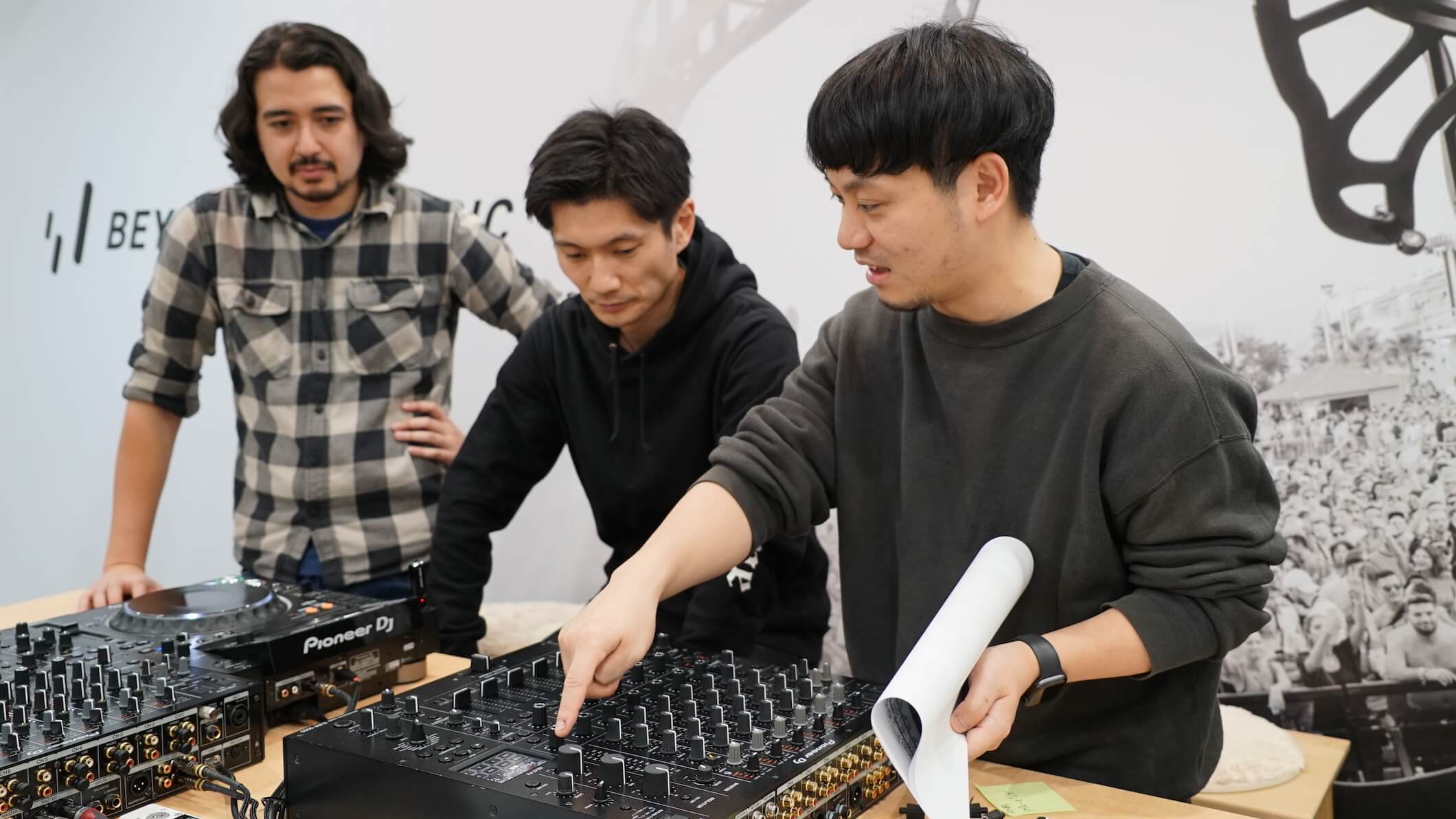
Overall design of DJM-V10 is completely different from other mixers, and it’s centered around warmer tones. What was the first thing in your mind about the whole design?
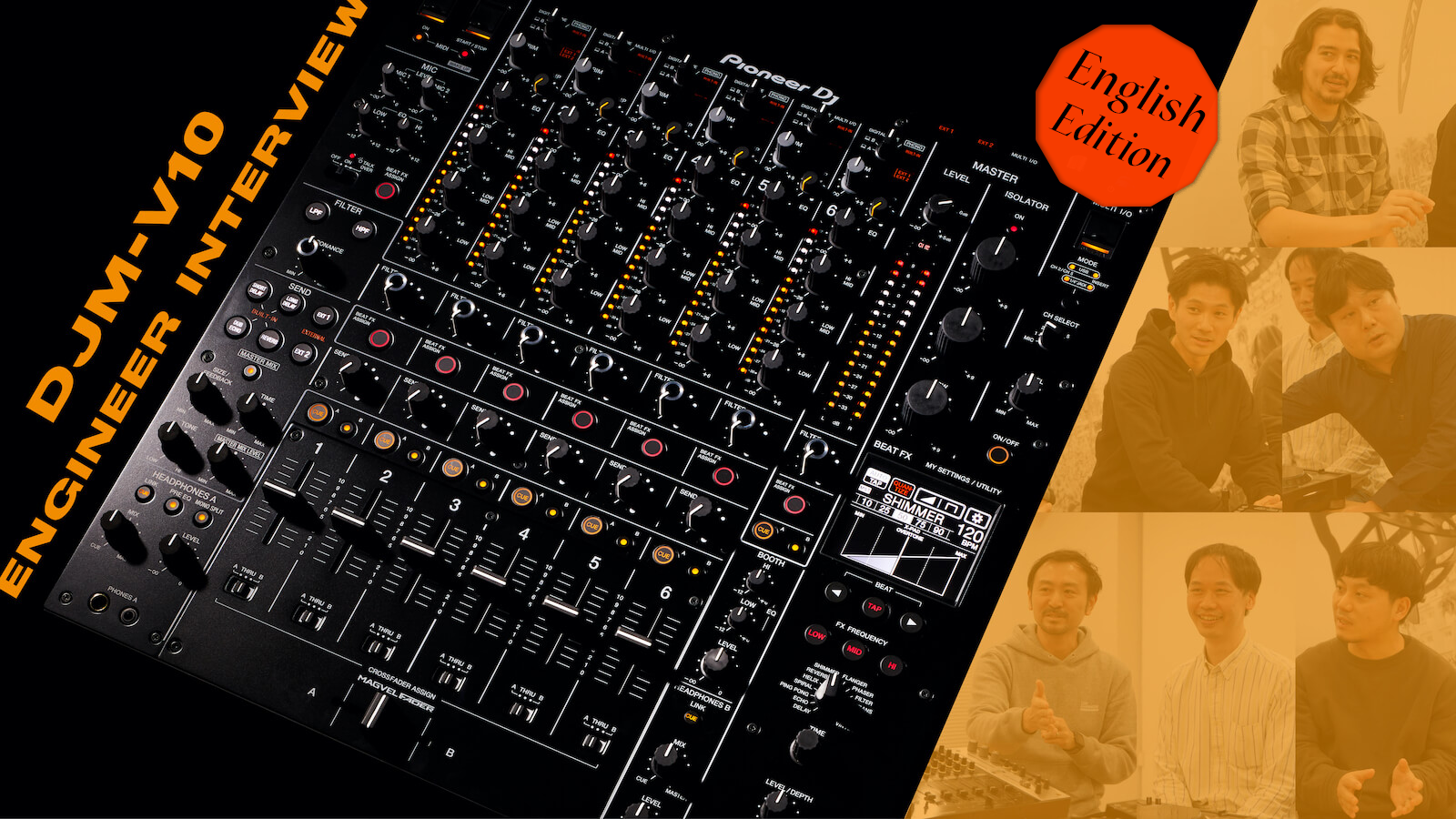
Kuramoto: There are two main things we’ve cared for DJM-V10’s design. First, to visualize “warm sounds” that we’d been visioning as a project concept from the start. That is to say, allowing our users to visually recognize: “this mixer has very different sounds from DJM-900NXS2, and it’s got much warmer audio”. And another important thing for us was to make it as simple as possible. To begin with, as the design concept, I’ve kept saying: “let’s create a flat and neutral mixer just like a painter’s palette”… You see, this is such a poetic wording so it’s a bit embarrassing to say this each time, to be honest. [laugh] But we were sure that many people are hoping for more creative mixing styles than what you could do with DJM-900NXS2. So, while we made minimum differentiations in features [from DJM-900NXS2 to DJM-V10], we went for a flat design; something not let you think like “oh I have to play this on this channel, and I have to use this Filter in this way”. But instead, [we designed a flexible mixer] just like a painter can freely decide which color goes where in their palette, and they can mix those colors as they wish. I was also in charge of DJM-900NXS2 design, but that was more based on “additions” considering a lot about users’ visibility… all the buttons like Cue and Sound Color FX was lighted in different colors so that you can see each clearly in a dark place, or bordering each section in white lines for easier distinguish. But because DJM-V10 has 6-channel, it would be messy if we try to incorporate all those, which is the reason why the design [of DJM-V10] is more about “subtractions” from DJM-900NXS2.
Takahiro Kuramoto – Design Center
While subtractions being the main theme here, I feel the design really screams: “it’s not DJM-900NXS2’s replacement model, but rather something completely new”. What made you take this bold shift in the design?
Kuramoto: There’s been so many unexpected things this time… This side-wooden design for example was a game-changer. I was assuming this won’t be a popular choice at first to be honest, but I brought it anyways to a meeting just as a teaser. Then, what a surprise, this ended up being everyone’s favorite. [laugh] Well the side-wooden was maybe too much and considering its feasibility it went down in the drain after all, yet, what this made me realize was the fact that “people are looking for a digital mixer as classical as analog masterpieces”, which motivated me to design something drastically unique.
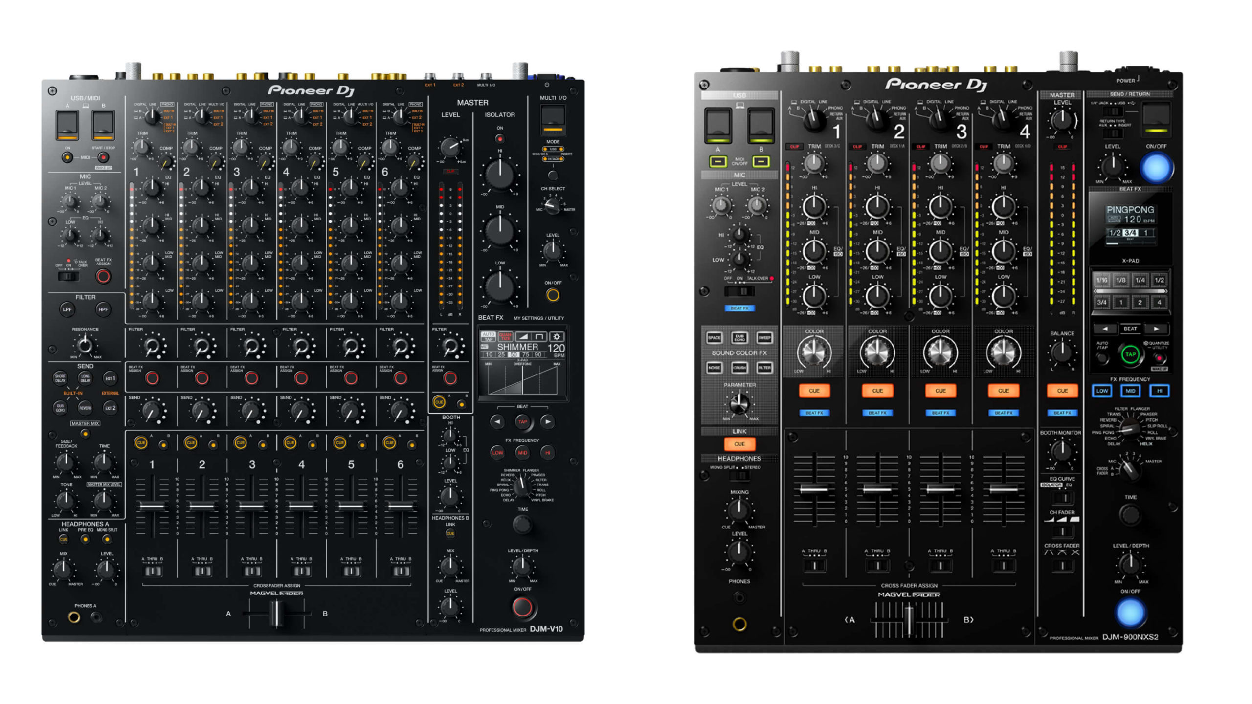
Left: DJM-V10 / Right: DJM-900NXS2
So, while you were working on the design based on subtractions, what are particularly unique features to DJM-V10?
Kuramoto: It was one huge change to unify everything in warmer tones, and to make it simpler was another. We made our buttons round this time, but it’s not only associated with the warm and roundish sound. Our previous mixers have lots of [shape] elements, from squares to circles to rectangles. It’s indeed easy to distinguish as they are, but considering that knobs have to be round no matter what, I came to think that making each component round and consistent would put everything together, and make it looks cleaner. I’m happy it turned out very uniformed and simple with refined buttons and meters. That was at the same time one of the hardest parts [in the designing process].
We were so particular about this simplicity, that we used the same knobs for Send and Filter until the very last minute. But when I touched them by myself I realized that: “this [exact same knobs] can be confusing in quick performances”. From time to time, we prioritized usability [to simplicity].
Montpetit: We designed it as flat as possible by reducing components, yet there were still things we couldn’t notice until we put our hands on it, since the mixer has so many channels and new features to offer. For example, displayed the channel numbers was a big move for us, [because] we often experienced things like: “wait I thought I was turning up channel 2 but it was actually channel 3”. Another example, we repeated trial and error for buttons’ and knobs’ zoning on top of a type of knobs; again, Send and Filter can be confusing for a quick operation. We carefully considered even a thickness of each line.
Kuramoto: For our previous models like DJM-900NXS2, take Sound Color FX for example, printing was done in three-step: transparent printing, then fine dots, and lastly write letterings. But we knew we can’t achieve the simplicity we want in DJM-V10 in the same way, while also referencing other companies’ design. Visibility is crucial when it comes to mixers’ graphic design. For DJM-V10 we decided to use one stroke line for zoning and grouping, and what’s most important is, people using DJM-V10 for the first time as a club standard model can easily get “where are EQs” or “where are Filters” at the first glace. We tired dozens of design patterns, from a detailed belt zoning design to orange lines. We exceptionally did our absolute best to keep its simplicity, while perfectly retaining its visibility.


